Advanced Colour Analysis - 12 Seasons Colours
Sep 29, 2022
Corrections have been made to this blog post. Please refer to the footnote for the corrections.
Previously, I’ve discussed the four seasonal colours and ways to diagnose your seasonal colours through undertone or colour temperature analysis and depth or value in my previous blog posts. That said, we also need to take into account chroma, which defines colour saturation and strength.
· Bright and clear colours are high chroma colours.
· Muted and soft are low chroma colours.
You may click here to read my previous blog post 'Colour Analysis: How It’ll Help You Look Incredibly Beautiful'.
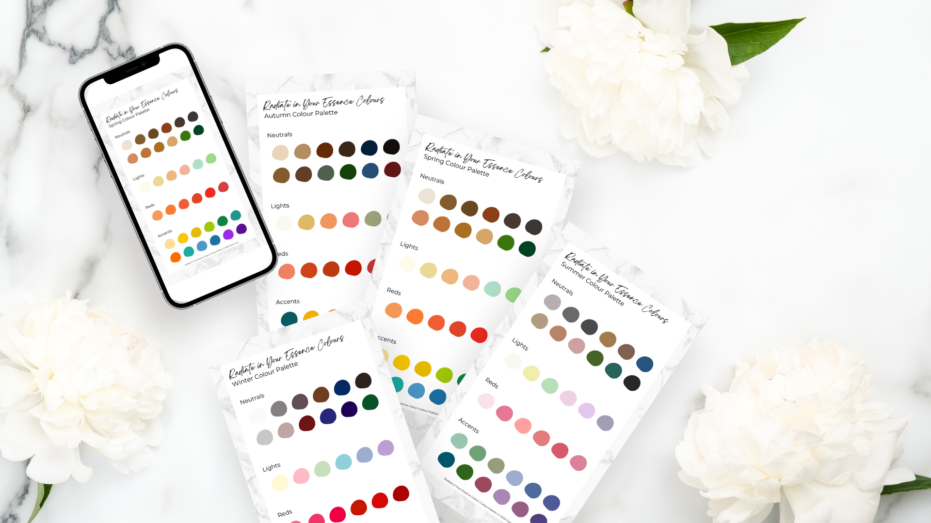
Take a look at the colour palette of each season. Summer and autumn colours are both muted and have a warmer tone. Spring and winter are bright and clear, the undertone is cooler.

If we’re to add chroma to the colour analysis of the four seasons, we can create the 12-season colour model. The three colour aspects will result in not only four but six different characteristics.
· Cool or warm (temperature)
· Dark or light (value)
· Muted or bright (chroma)
What is the flow theory?
The four seasons are separate and distinct in the colour analysis. Using the 12-season colour model, you can tell that not every person will fall into one of the seasons.
By adding chroma to the picture, the seasons will flow or overlap with each other. Before determining that, though, let’s look at the 12 seasons' colours.
The four different seasons have been subdivided into three sub-seasons for each, in which the cool or warm sub-seasons will represent the original four seasons. See the graphic below.
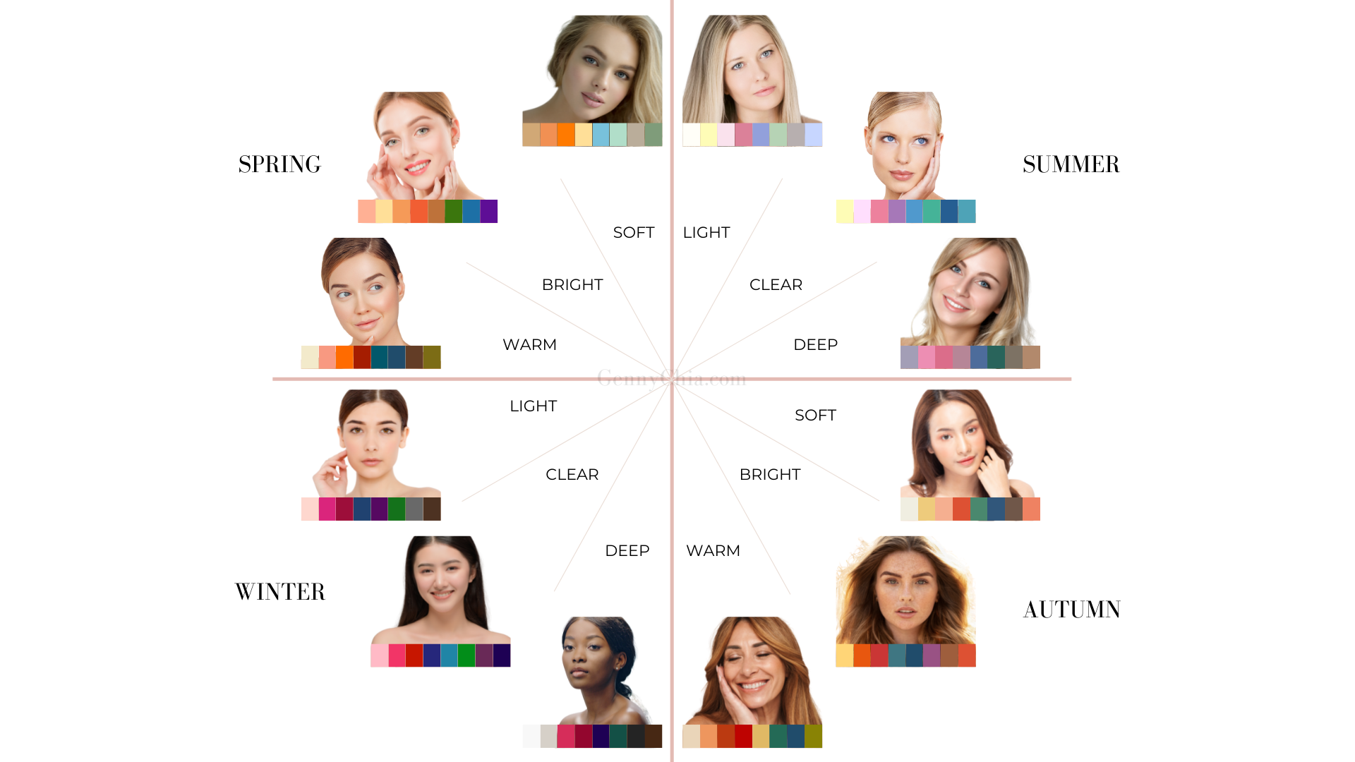
Spring is also bright aside from being warm and light, and this creates the sub-seasons:
· Soft Spring = light + warm
· Bright Spring = bright + warm
· Warm Spring = dark + warm
Summer, on the other hand, is also muted in addition to being light and cool. Think about pure hues with white added, desaturating the colours and making them lighter. Its sub-seasons are:
· Light Summer = light + cool
· Clear Summer = clear + cool
· Deep Summer = dark + cool
Autumn is also muted in addition to being dark and warm. Its sub-seasons are:
· Soft Autumn = light + warm
· Bright Autumn = bright + warm
· Warm Autumn = dark + warm
Winter is also bright aside from being dark and cool. Its sub-seasons are:
· Light Winter = light + cool
· Clear Winter = clear + cool
· Deep Winter = dark + cool
Each sub-season features or highlights two primary aspects out of the three colour aspects, as you can see.
The main aspect of Light Summer is cool and also light, while Deep Summer is darker and also cool.
On the other hand, Soft Autumn is lighter; however, it’s warm in contrast to Light Summer.
So if you would notice, every colour season is flowing perfectly into the next colour season along the three dimensions of colour.
As the four seasons colour model reveals, we can conclude that summer doesn’t begin overnight when the spring season is over because spring moves into summer and the early days of spring look and feel different from those of the late days of spring when we’re surrounded by luscious green foliage. The different seasons flow into one another gradually, not suddenly.
How to Match Your Colours to the Seasons
Every colour palette in every season mimics the colours we can find around us, as nature moves and adapts through the seasons all year long. Every season, in this sense, has its own set of harmonious colours.
But then, what synchronises the colours?
Let’s illustrate it using autumnal colours. Take a look around, and you’ll find warm, rich, and dark hues in autumn. These colours are what make autumn unique on its own, like we won’t associate bluish colours with autumn because it doesn’t exist in this season.
It is safe to say that autumn colours are harmonious because they have uniform hues, temperatures, and chroma. Although there are definitely darker and lighter colours, most colours fall around a specific value level, which is dark. The same applies when you consider the 12 seasons' colour palettes.
What are the colours of each season?
Before we can determine this, it’ll help to return to the three colour dimensions. To begin with the discussion, let’s use temperature – cool vs. warm.
A colour is cool if it’s blue-based and warm if it’s yellow-based.
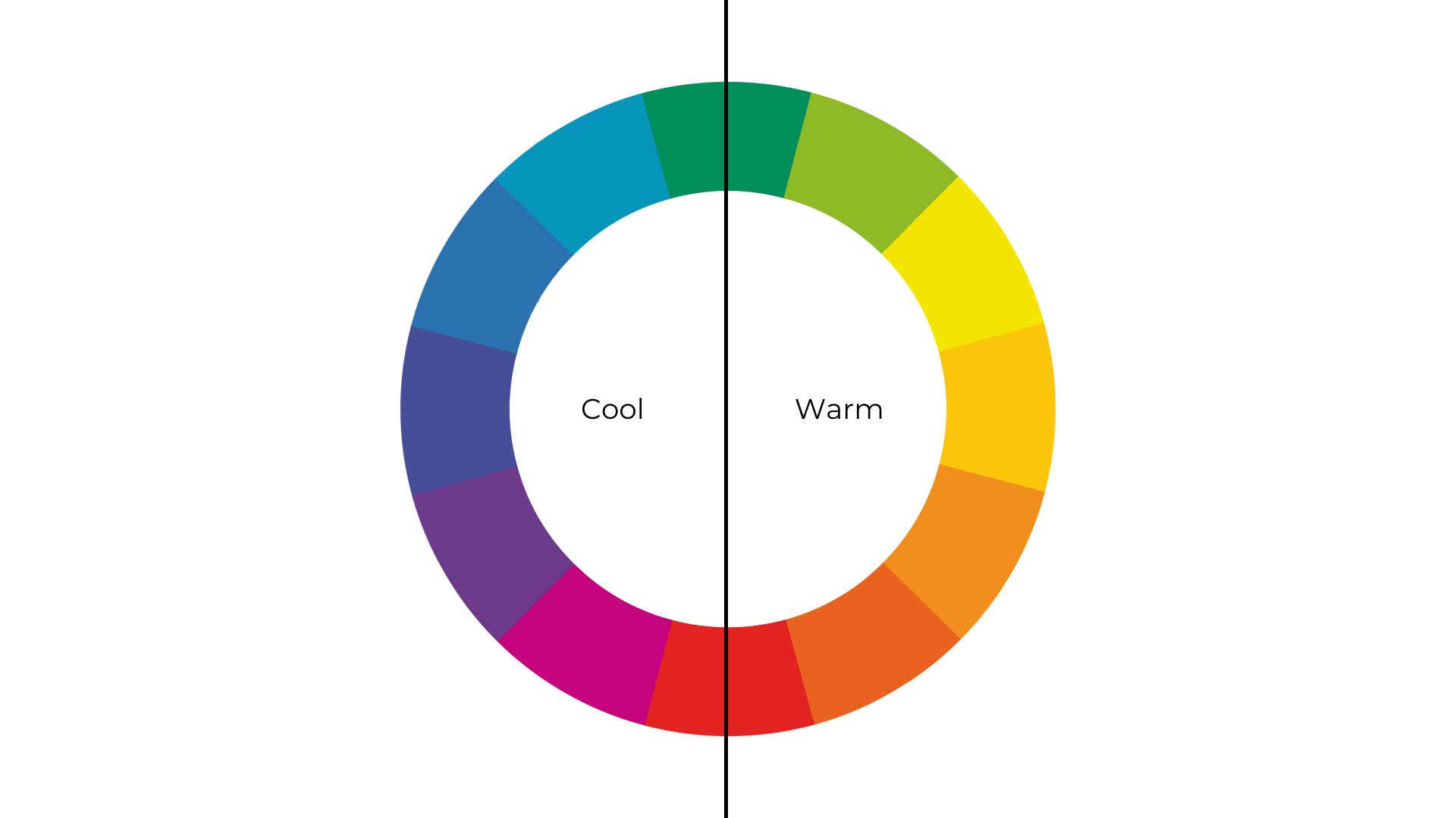
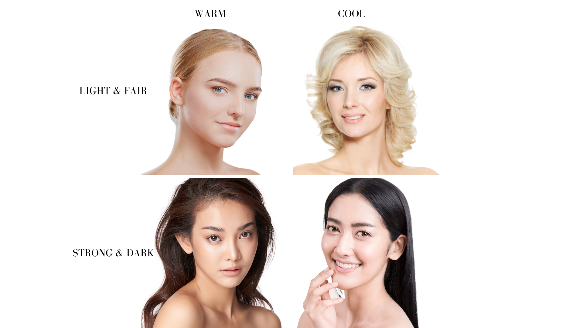
Take, for example, you’ll find no blue undertones but yellow ones in an entirely warm colour, making it belong to either Bright Spring or Bright Autumn – as these are the two warm seasons.
Meanwhile, those with blue undertones but without yellow ones are cool colours that are categorised as either a Clear Summer or a Clear Winter, referred to as a cool season.
Cool and warm are relative concepts. Based on how much blue or yellow is added to a colour, it can be either cool or warm.
A cool yellow will appear somehow greenish, while a warm yellow will appear yellowish. The reason is that you’ll get green if you mix blue with yellow, for instance.
On the other hand, a colour will look greenish if you combine yellow and blue due to the yellow undertones. Doing so alters the saturation of the pure hues.
Warm colours are classified as either True Spring or True Autumn, while cool colours are either Clear Summer or Clear Winter. However, it might be hard to decipher which of those mentioned two seasons' colours you belong to.
To determine the answer, let’s use value – darkness or lightness, and chroma – brightness or greyishness.
Warm colours have a lot of yellow in them. At its basic, yellow is light coloured (pure yellow), and blue is dark coloured (pure blue). But then, this will become darker if you mix blue into yellow and lighter if you mix yellow into blue.

Now, can you see the two different hues that appear muddier in the middle of the chart? Those are already muted and not bright and pure colours anymore. If we add chroma or the third colour dimension to this picture, we’ll get –

The highest chroma is in the purest yellow and blue forms. Their pure colours, however, change when they’re mixed with each other, resulting in a change in both value and chroma. Plus, the colours become less bright and less clear.
If you rearrange the chart, you’ll notice the idea behind every seasonal colour analysis model. Both Bright Autumn and Clear Summer have muted colours. Meanwhile, Bright Spring and Clear Winter have the clearest and purest forms of both blue and yellow. This leads us to the conclusion that –
Spring has lighter colours, as it’s generally lighter, brighter and warmer. Yellow is inherently light and warm, and we can find many tints in spring.
Autumn has many darker colours being warm but muted because light yellow is added with inherently dark blue, resulting in darker and muddied colours. It is why we find tones and shades in autumn.
Winter has many darker colours being bright and cool, as blue is predominantly a cool and dark colour. But then, remember that winter is a high-intensity and high-contrast season; thus, we find both tints and shades in winter.
Summer has lighter colours being completely cool but muted, as predominantly dark blue’s been added with inherently light yellow, resulting in lighter and more muted colours; thus, we can notice a lot of tones in summer.
Primary Qualities of Each Colour Palette
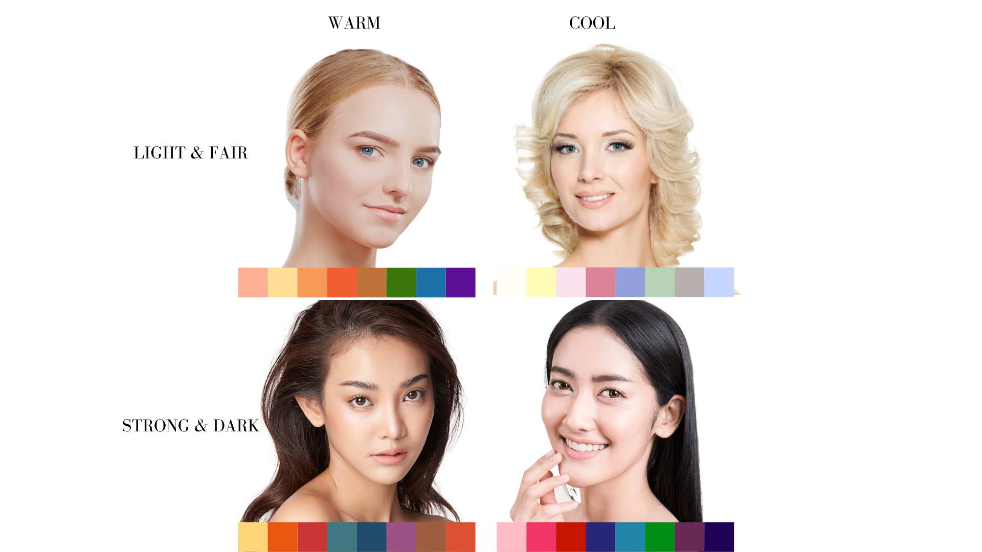
So, how does this relate to the 12 seasons colour analysis? The same principle applies to it, but you must take note that each season has its three distinct sub-seasons, making three different colour palettes for each season.
Such three palettes will look quite similar, but their colours may be muted/brighter, warmer/cooler, or lighter/darker depending on the primary colour aspect of the sub-season.
For example, summer’s sub-seasons are Light Summer, Clear Summer, and Deep Summer. The colour aspects of the three seasons are quite similar. Still, they’re not the same. Light summer is the lightest, Clear Summer is the brightest with high intensity, and Deep Summer is the most muted and darkest.
The concepts discussed here are basic colour theories that one would learn during an art lesson. I hope you find the information useful. As mentioned in my previous blog posts, most of my clients find this advanced colour system too complex, and they are happy with the basic colour system, which identifies their seasons, more importantly, the colours to avoid.
I've created 4 free colour palettes that will show you how to wear your beautiful colours stylishly. To receive the gifts I've prepared for you, click here.
Correction: Incorrect Labelling of Images
I would like to express our sincere gratitude to Kristy for bringing an error in this blog post to my attention. I deeply appreciate the efforts of readers in helping me maintain the highest standards of accuracy and credibility.
Upon reviewing the blog post, I identified three mistakes in labelling the images accompanying the article. I apologise for any confusion caused by this oversight. Please accept my sincerest apologies for the inconvenience it may have caused.
Below, I have explained the amendments made to this blog post:
Image 1: Incorrect label of warm vs cool colours

Corrected image as presented currently on the blog:

Image 2: Incorrect label of warm vs cool colours

Corrected image as presented currently on the blog:

Image 3: Incorrect label of warm vs cool colours

Corrected image as presented currently on the blog:

I have taken immediate steps to rectify this error and have updated the article accordingly. The correct labelling of the images can now be found within the article.
Once again, I extend my heartfelt appreciation to Kristy for her diligence in bringing this issue to my attention.
Sincerely,


